

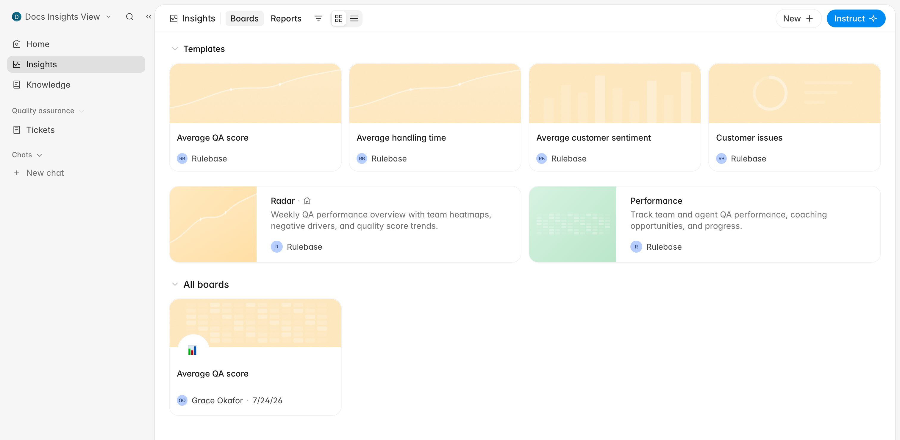
Which surface answers your question
Before you start
- Everything here is built from evaluated interactions. Until a published scorecard has produced evaluations, these pages have nothing to draw.
- Who appears in performance views comes from the agent roster, not from who has a login. See Manage the QA agent roster.
- Reading Insights needs a role carrying View organization-wide reports and analytics and, for the performance pages, View agents and performance reports. Every system role except Agent has both; agents get their own evaluations and performance instead.
- Grouping boards into sections, and managing boards you did not create, needs the Manage organization settings permission, in practice an admin.
Boards are yours to arrange
A board is a custom dashboard: a set of charts you place, filter, and re-use. Starting from a template is faster than building one chart at a time, because the template arrives with the charts that usually belong together: a headline number, a trend, and a channel breakdown.- Open Insights.
- In the Templates row, click the template you want.
- In Create board from template?, click Create board.
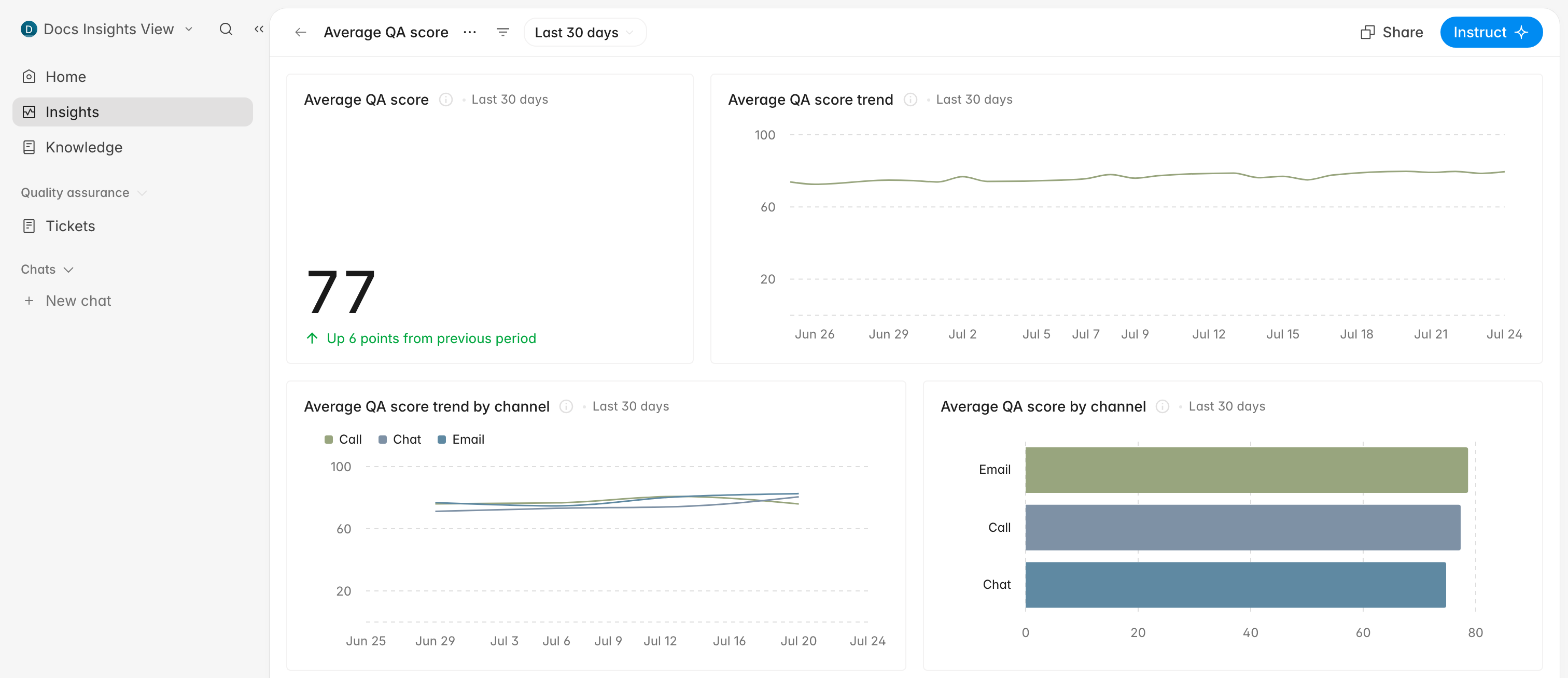
Reports read like a written answer
A report is a written answer rather than a chart. Rulebase runs it on your schedule, fills it from your QA data, and delivers it by email, Slack, or both. Use one for the recurring “how did last week go” question. Click New report on the Reports tab and describe what you want. The composer opens withSend me a weekly report of already typed, and the
conversation that follows is where the report’s subject, cadence, and recipients
get settled. Reports you already have appear under Your reports on the same
page.
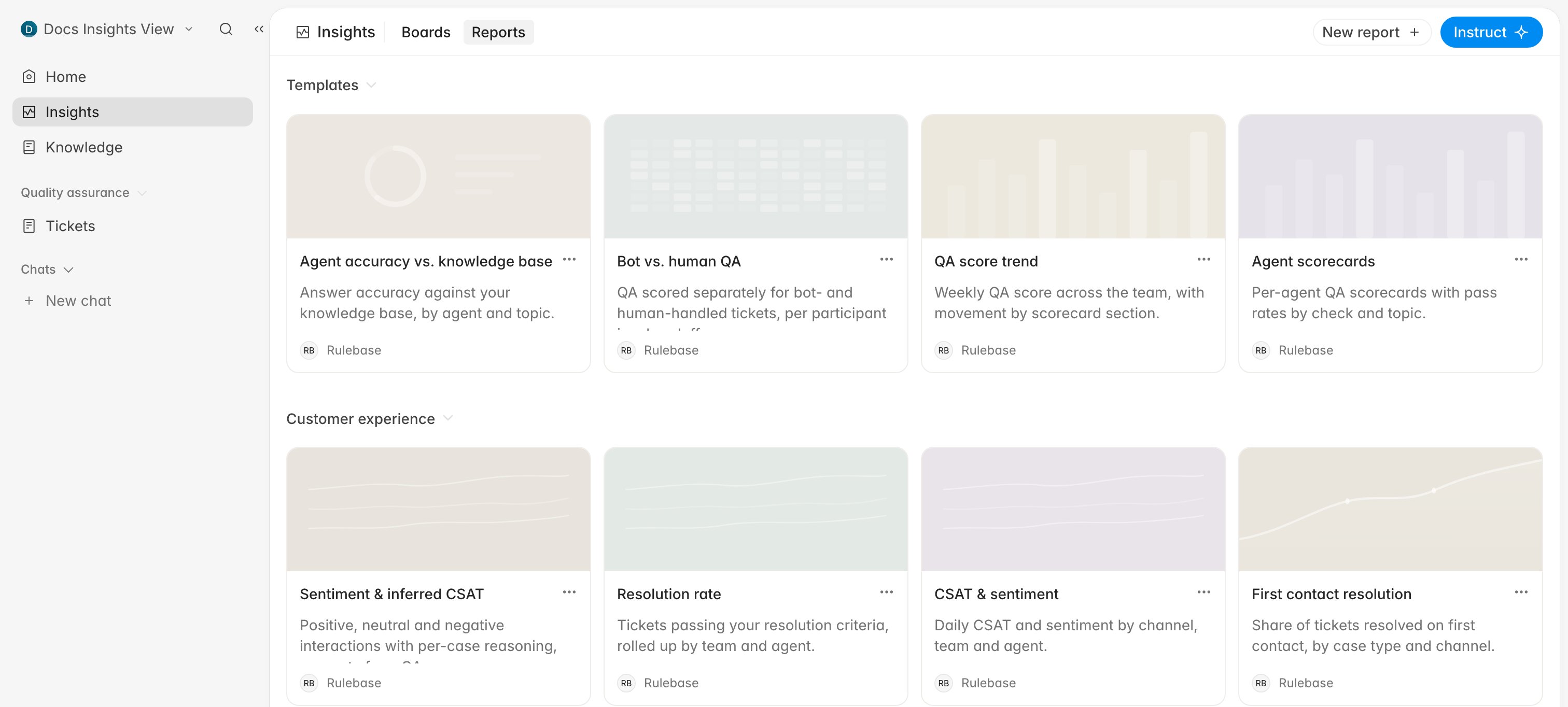
The template cards on this page are samples. Clicking one opens a preview of what
that kind of report looks like, filled with example content; it does not create
the report. Use New report to get a real one, and mention the template’s name
if you want something shaped like it.
Performance answers “who”
The Performance card leads to a list of teams with their QA scores, each team opens onto its agents, and each agent has a page carrying their tickets, evaluations, and coaching history. Use it when a board tells you something moved and you need to know who it moved for. Use team and agent performance covers that route end to end.Radar
Radar is the ready-made view: a row of headline metric cards over six standing charts: QA score overview, scorecard adherence, overall trends, handling time on service issues, complaints by volume, and your top service issues. You cannot add to it or rearrange it; it is the same page every time you open it, so changes stand out. The date range picker at the top right is yours to move. Radar is also your homepage until you choose otherwise, so signing in usually lands you here. Any board’s card menu offers Pin, to keep it in the Pinned section at the top of Insights, and Make homepage if a board you built deserves that spot instead. Setting a team as your homepage does the same thing, and either one replaces Radar as your landing page.Export the underlying rows
When someone needs the underlying tickets in a spreadsheet:- One-off analysis: filter the Evaluations list and export a workbook. See Export QA evaluation data.
- A recurring spreadsheet in an inbox, or QA data landing in your warehouse: Schedule recurring exports.
- The conversations behind a single chart segment: open the drilldown and use Export as CSV, as described in Manage charts on a custom dashboard.